
I'm fascinated by population density maps. Here are a few interesting ones I've come across:
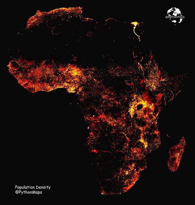
Population density of Africa:
Population density of Australia:

This is something called the Yuxi Circle, the world’s most populated area:

Here's a photo taken by NASA of the Iberian Peninsula at night.

Here's what the population of New York City would look like if it were spread out according to current population density in the red areas.

Here's a similar depiction of Los Angeles County's population:

And Chicago's:

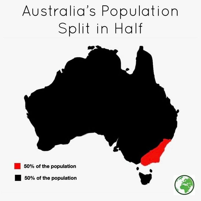
Here's Australia's population, split in half.
Here's another view of Australia's population.

How about states with a smaller population than Los Angeles County:

Apparently 50% of Canada's population lives south of the red line:

Look at all the empty places in New Zealand:

How about this? (The red nation is Bangladesh.)

Or this:

This link gives world population densities.

And this fascinating website allows you to drag-and-drop to compare the true size of one country against another.

So there you go. Just some food for thought for the week ahead.


