The front cover art for my latest book "The Amish Midwife's Bargain" (available in November) has been finalized.
I stinkin' love this cover. Also, I believe this is, hands down, my favorite book I've written so far, and I'm pleased the cover art reflects it. The hero, incidentally, has a severe facial disfigurement, so my editor suggested he be featured from the back.
What's interesting is how this cover evolved. For every book, authors must submit a detailed "Art Fact Sheet" to help the art department design an appropriate cover. Among the information we submit are sample photos of real people who resemble the characters, as well as background images resembling three different scenes in the book.
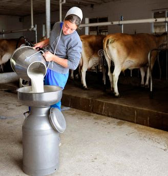
For obvious reasons, photos of Amish people in precise settings are hard to find, so most of the time I simply use "English" people. However I was fortunate enough to come across this photo and instantly uploaded it to the Art Fact Sheet:
(I kinda wish they'd kept the Jersey cows from the original photo instead of turning them into Holsteins on the cover, but whatever.)
You can see how well the art department blended the original photo with the elements of the story.
An earlier version of the cover (which I'm not permitted to post) had some problems. Per the email I wrote to my editor: "I have two smallish concerns. One, it looks like the hero is wearing jeans and a belt. The Amish wear neither. Perhaps the art department could remove the belt and stitching, and just make his trousers a solid color? And two, there is an electric fan to the right of the Hero's head. (If I peer closely, it looks like a couple of electric ceiling lights too, one of them to the right of the heroine's head.) Obviously the Amish wouldn't have anything electric, so hopefully those can be removed. Otherwise the artwork is beyond beautiful – the colors, the postures, everything."
The final cover addressed every one of those concerns, and I couldn't be more pleased with the result. I have to admit, the art department at Harlequin absolutely rocks.
I thought you'd appreciate a little glimpse into how a book cover evolves.


Beautiful. Those supporting beams look like a series of crosses coming from back to front and really add to the visual structure. And the lighting is perfect.
ReplyDeleteI've read your blog for several years, and take enjoyment from it despite having little interest in the genre of novels you write. Your parenthetical comment captioning the photo reminded me of one reason why that is: I absolutely understand the wish that the Jerseys hadn't transformed into Holsteins!
ReplyDeleteWhile I am glad that your next book is coming out , I am disappointed that I have to wait till November!
ReplyDeleteThank you, it's wonderful to get details like these about publication. I never thought about book cover designing but that's certainly an important part of it!
ReplyDelete