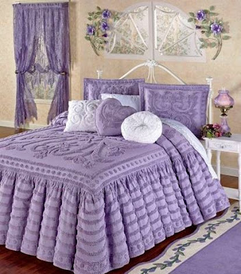
When I was a very little girl living in western New York State, we had neighbors who had a daughter several years older (I'm guessing she was a teenager, but I don't remember). I think her name was Donna. Donna's favorite color was lavender, which was something of a trendy color among girls in the 1960s. Because I admired Donna, I decided my favorite color was lavender as well.
Thankfully that preference was rather short-lived, and until I was an adult I don't recall having a favorite color at all – except I leaned toward earth tones as opposed to pastels or jewel tones.
Recently I stumbled across a BBC article that described the almost universal preference for the color blue: "The dominance of blue in such lists doesn't surprise Lauren Labrecque, an associate professor at the University of Rhode Island who studies the effect of color in marketing. Like a Pantone-sponsored party trick, she'll often ask students in her classes to name their favorite color. After they respond, she clicks on her presentation. "I have a slide already made up saying '80% of you said blue'," Labrecque tells them. She is usually right. "Because once we get to be adults, we all like blue. It seems to be cross cultural, and there's no big difference – people just like blue."
But not me. I've never been a "blue" kinda gal. Now that I'm all grown up, I can say without hesitation my favorite color is green. Push me a little further, and I'll give you a green/brown combo, or any variation: emerald/gold, sage/sand, forest/walnut, etc. I still lean toward earth tones (though not, I should clarify, the 1970s version with avocado green or burnt orange). For decorating purposes, I prefer a warm palette (brown undertones) over a cool palette (gray undertones). It's why I like wood as both a building medium as well as a furnishings option.
"But why do we have favorite colors?" inquires the BBC article. "More importantly, what drives those preferences? Put simply, we have favorite colors because we have favorite things."
Ahh, that explains it. I like earth tones because I'm a Nature Girl. In my younger days I was a field biologist. Now we're homesteaders. I like the outdoors.
Along these lines, many years ago I wrote an essay poking fun at how colors are named for retail or commercial purposes (understand the references are years out of date) that I thought you might enjoy reading. Without further hesitation:
The Color of a Cow Running Away
There's a book I bought a few years ago that I enjoy re-reading. It's called "It Takes a Village Idiot" by Jim Mullen, and it chronicles the journey of a cynical columnist who moved from urban Manhattan to rural Upstate New York.
The author's wife worked in the garment district, where part of her job was to name the colors for each new season's yarn lines. "Nothing in the fashion world is every simply blue or green," he writes. "How would customers know it was not something from last season or, God forbid, last year? The name had to scream: Right Now, Today, This Very Moment. Sapphire, emerald, topaz, lapis lazuli. Blueberry, strawberry, grape, tangerine. Rose, magnolia, iris, peony. Bone, heather, teal, aubergine. Concrete, steel, brick, acoustic tile. All had had their run. After ten years, four seasons a year, she was running out of ideas. It was getting hard not to repeat herself." Apparently this woman's epiphany that it was time to get out was when she came up with "the color of a dog running away."
I never thought about this. I mean honestly, it never crossed my mind that someone has to think of these color descriptions for the mountains of new fashions that are introduced each season. I filed away this bit of trivia in my mind.
But it did raise my awareness about color descriptions.
Just to take a random example: log onto Ralph Lauren's paint website and click on "lifestyle colors." If something is described as a "lifestyle," you know right away they're going to steer you toward whatever predisposed lifestyle notion you're trying to capture. You're given the options of Modern Light, Urban Loft, Vintage Masters, Island Brights, Naturals, Whitewash, and Thoroughbred. Without even looking at the colors or the sample photos of decorated rooms, you kind of know what to expect.
Randomly clicking on Vintage Masters, I found the following color options with which I could adorn my home. Each of these, I'm not kidding, describes a shade of blue: Vermeer, Renoir, Reflecting Pool, Whisper, Cloud Blue, Wisteria, True Blue, Cowgirl Blue, Calypso, Canyon Blue, Almofi Navy, Lisbon Blue, Spanish Bluebell, Bellflower Blue, Durango Blue, Blue Mesa, Washed Navy, Blue Leather, Chateau, Prussian Blue, Shoreline Blue, Shale Blue, Faded Seafoam, Emperor, Blue Lagoon, Café on the Riviera, and Impressionist. And this is just for BLUE.
And on and on it goes, for literally hundreds of color options. Duke Red. Who decides what color red a duke wears? Coastal Beige. What color is a coast, after all? Alpine Pool (a shade of green). Has anyone been to an alpine pool lately? One of my favorites was Gust of Wind. Guess what color a gust of wind is? If you guessed "clear," guess again. It's white.
Faced with these descriptive options, the color of a dog running away isn't so outlandish after all. Obviously color descriptions can have a powerful effect on marketing. And nearly all of them, you'll note, suggest something natural or rural in its imaging. Can't have Sidewalk Vomit Orange or Homeless Man's Pants Gray, after all.
Recently we received an Eddie Bauer catalog in the mail. (One of those random mailings since the idea of any of us wearing Eddie Bauer clothing is pretty laughable.) My younger daughter started reading out loud the descriptions for the color options for a line of cardigans and tank tops: Sunset Orange, Dark Lava, Chambray Blue, Mulberry, Orchid, Fossil, Spearmint, Dusty Aqua, Seapine. Another line of shirts included the colors Water, Nectar, Dusty Coral, and Radish. Sometimes they even had freakishly counterintuitive color descriptions such as red, black, white, or blue. (Weird, I know.)
On and on it went. Our daughter kept reading adjectives and we kept laughing our heads off. It got to where she had us in stitches as we tried to guess the colors. Dark Thyme. Chestnut. Peat. Pewter. Chalk. Camel. Ocean. Driftwood. Current. Pool. Apple. Oak. Fuchsia. Steel. Cocoa. Oyster. Sugarplum. Nordic. Smoke. Citrus. Aloe. Wedgewood. Aster. Flamingo. Brook. Mink. Admiral. Bluegrass. Punch. Margarita. Lagoon. Eclipse. Hibiscus. Coast. Lily pad. Geranium. Sky. Cosmos. Slate. Primrose. Spa. Atlantic. Mocha. Cactus. Maritime. Oyster. Redwood. Pebble. Cassis. Graphite. Sand. Herb. Birch. Tumbleweed. Sprig. Cayenne. Basil. Dragonfly. China. Mushroom. Ochre. Loganberry. Honey. Papaya. Safflower. Celery. Sage. Champagne. Steel. Sorry if there are any repeats, it was kind of hard to keep track.
And this is just ONE catalog of ONE season of ONE company. Someone had to come up with all those names. Think about it.
As I said, almost every color description you'll come across evokes some sort of natural or rural theme. If you don a "dark thyme" T-shirt, will you find yourself transported to a pretty garden with lots of herbs growing in luxurious profusion? Sure you will. And you, the lucky wearer, can snip herbs and play Martha Stewart to your heart's content. See the connection?
"What I think they should do," proposed my daughter, putting down the catalog, "is to give colors real names that represent real country life. Like Cow Patty Brown. Or Mud Boot Black."
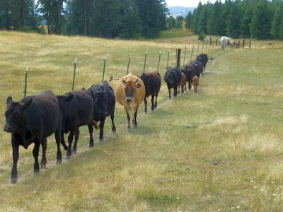
I agree. But I don't like the Color of a Cow Running Away. I far prefer the Color of Cows Coming Back.


This was interesting and something I'd never thought about. I was tickled to read that your favorite colors are green and brown. The same is true for me, with blue being not far behind. My kids call me "Nature Girl" so there must be something to what you say.
ReplyDeleteI love the green of nature, but I hate green for wearing or decorating. My favorite color to wear is pink. I suppose I need to clarify that is it is the pink of hibiscus or crape myrtle. So, nature after all. Last week, I was reading colors aloud from a clothing catalog to Tommy while we both laughed. Okay, red is a favorite, too.
ReplyDeletePaint companies do the same thing with their colors.
ReplyDeleteYellow... no, blue! Aauugghh.....!
ReplyDeleteHilarious!
DeleteThat was absolutely delightful. Thank you. PS: My wife's favorite is green, too. Me - blue (maybe 'cause of my blue eyes?).
ReplyDeleteHmmm, interesting and thought provoking. Colors mean different things to different people. My color preference have changed through the years and I can say now I have no color preference. But if I were to have to choose a single preferable color it would have to be whatever color "Free" comes in.
ReplyDeleteAnd since Nature is "Free", all that's needed is to go out and partake of it. And since Nature comes in all available and sometimes even new colors, I guess I'd have to say my favorite is "All Of The Above".
I visited a friend who was building a “man cave” shed in his backyard. In a nod to the Exodus story of the Passover, he painted the trim for the door blood red. The name of the paint: “No More Drama”….
ReplyDeleteGreen is my favorite color too. But I have a favorite green. It's the first green of spring, the color of new life. I've never seen it named and it deepens so quickly you have to look hard and enjoy it while you can!
ReplyDeleteWhen I was five or six, I got a pair of Mary Janes with double buckles which were described as being the color "oxblood". I loved the color (and the shoes) , but after receiving a few "concerned" looks from adults with that response, I quit telling people that.
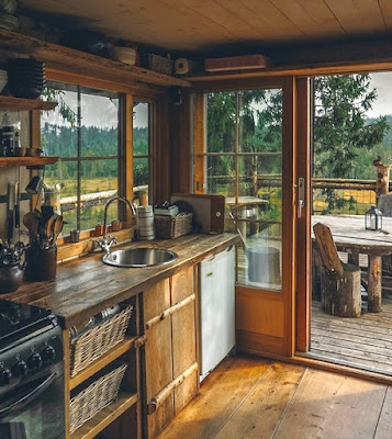
ReplyDeleteVery interesting on colors. My "favorites" depend on the "situation": eyes = green, cars (except Jags, Healeys, MGs, etc.) = Blue. Your Country Kitchen pic is perfect; no white painted sheetrock anywhere, just nice, warm country colors. Farm tractors = red.
ReplyDelete